There are three stages:
- Defining what "good" looks like for each channel
- Choosing which channel is best for each service
- Mapping out a channel strategy
What does good look like?
The first activity seems obvious but when you come down to it, it can be quite difficult to achieve. This is to answer the question, for each of your potential channels, "what does good look like?" Easy, one might think, you just need to look at what others have done in this area. Except that there seems to have been little actually published (or at least, that I could find). So here's a good research topic idea for someone – carry out a detailed survey of public sector channel offerings and identify good examples. This is a big project as we're talking about around 400 English Councils, then there's central government and all the non-departmental government bodies (like the Equalities Commission, Cafcass, Office of the Information Commissioner, etc.), not to mention NHS, Police and Higher Education; and in each case there are is a range of channels to consider – web, phone, face-to-face, etc.I have had a stab at this for my council and am happy to share the results with anyone who would like a copy of the report – it's by no means as thorough as the above suggests it should be, but it's a start. Post a comment if you want me to send it to you.
What channel is best?
Another aspect of this is that some channels will be better for some things than others – for example a web self-serve channel may be batter than face-to-face for getting information about swimming pool opening times, but face-to-face is better for dealing with complex, highly sensitive issues such as looked after children assessments. But there's a wide continuum between these extremes, and how do you choose target channels for the more subtle ones?
Mapping channel strategy
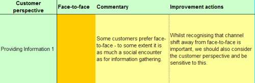
The third aspect of the process is mapping out for each channel what things look like now and what you want to achieve. This is a complex multi-dimensional picture because you have several "dimensions" - channel, type of service, customer perspective, supplier (Council) perspective and commentary. We have used a spreadsheet with worksheets for now and the future. There is a colour coded summary sheet for the now and the future dimensions (green equals good provision / suitability, red equals poor provision / suitability, etc.) - and each cell drills down to a more detailed commentary. Again I'm happy to share this with anyone who is interested. Below are some illustrations. Here's how to use them. Let's take providing "low level" information as an example (Providing Information 1). From the council perspective doing this face-to-face right now is "red" (which means: Service can be provided by this channel but quality is poor and/or cost is high) – Fig 1. From the customer perspective it's "amber" (meaning: One of [ Easy / Convenient / Accessible ] is not optimal) – Fig 2. In terms of the future, it remains "red" for the Council (Fig 3) and "amber" for the customer (fig 4) – so this suggests that we ought to provide this service via another channel if at all possible. Drilling down on any one of the four relevant cells will give additional information – Fig 5 shows the drill down if you click on customer/now.1. Channel map of "now" from Council perspective

2. Channel map of "now" from customer perspective

3. Channel map of "future" from Council perspective

4. Channel map of "future" from customer perspective

5. Drill down to commentary on customer perspective for now
So there you have it. I hope that it is helpful.
No comments:
Post a Comment